Cortico & Netos
Branding, Strategy, Web Design, Publication Design
Cortico & Netos is a Portuguese tiling company that creates handmade tiles from discontinued style lines from the 19th to 21st centuries. When developing my skills in brand identity, this project provided many opportunities to hone the necessary skills to effectively convey a brand’s image.
The Challenge
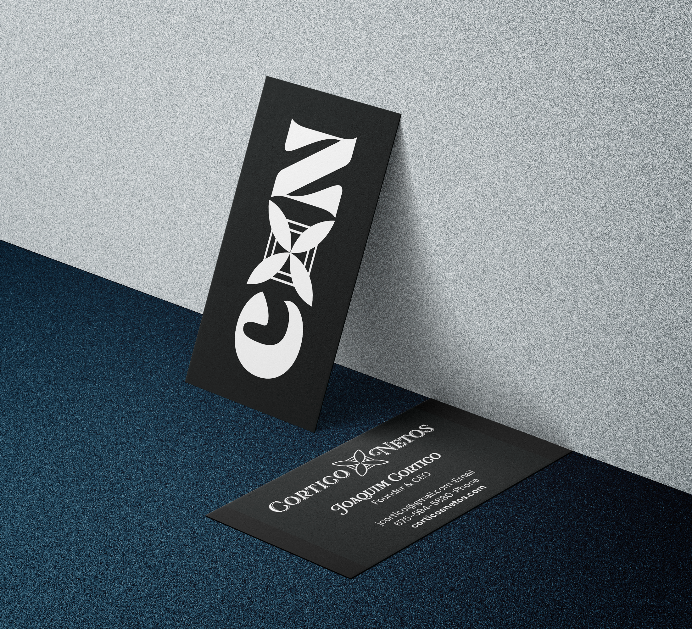
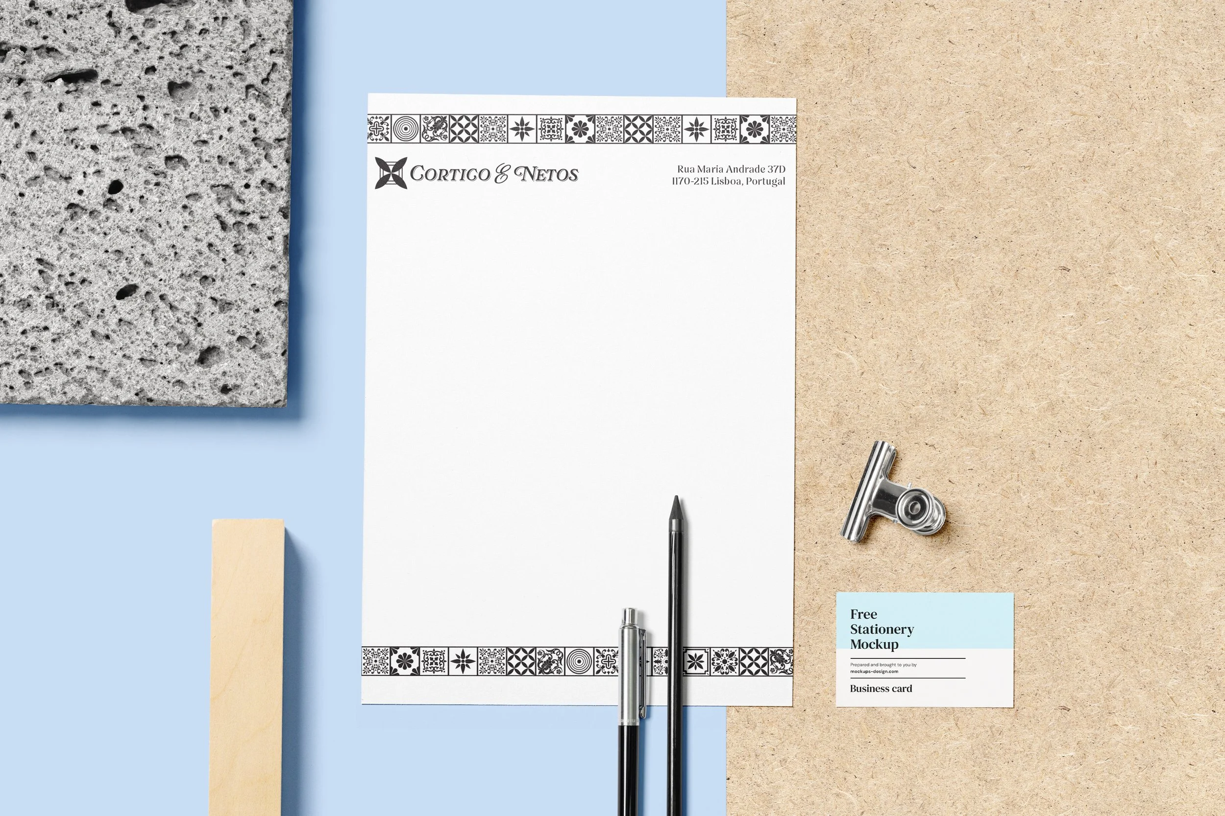
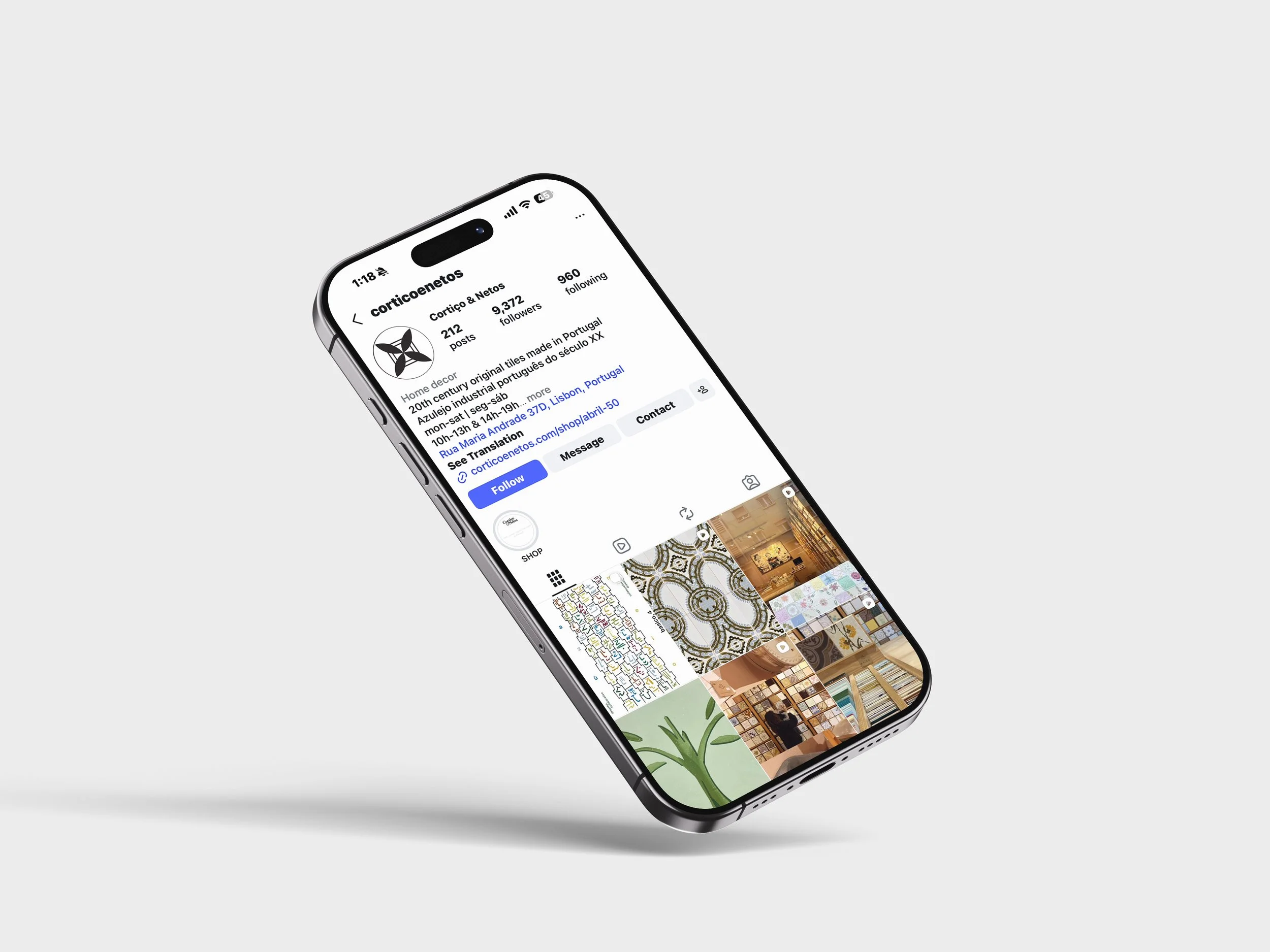
Cortico & Netos is a highly unique company, with a unique positioning within the industry. Their pre-existing visual identity was flat and simple, mainly focused on using imagery of their tiles to represent the brand. While this created unique visuals, their communications feature nearly identical pictures of the store, leaving their identity limited to their physical space. I worked to move beyond this.
The Solution
I began with extensive research into the history of the Portuguese industrial tiling industry to gain context for how to visually represent the brand while preserving and showcasing its rich history.
In design, outcomes without process lack value. In a world where an image can be generated in seconds, outlining an in-depth process is more valuable than ever.
Process & Outcomes
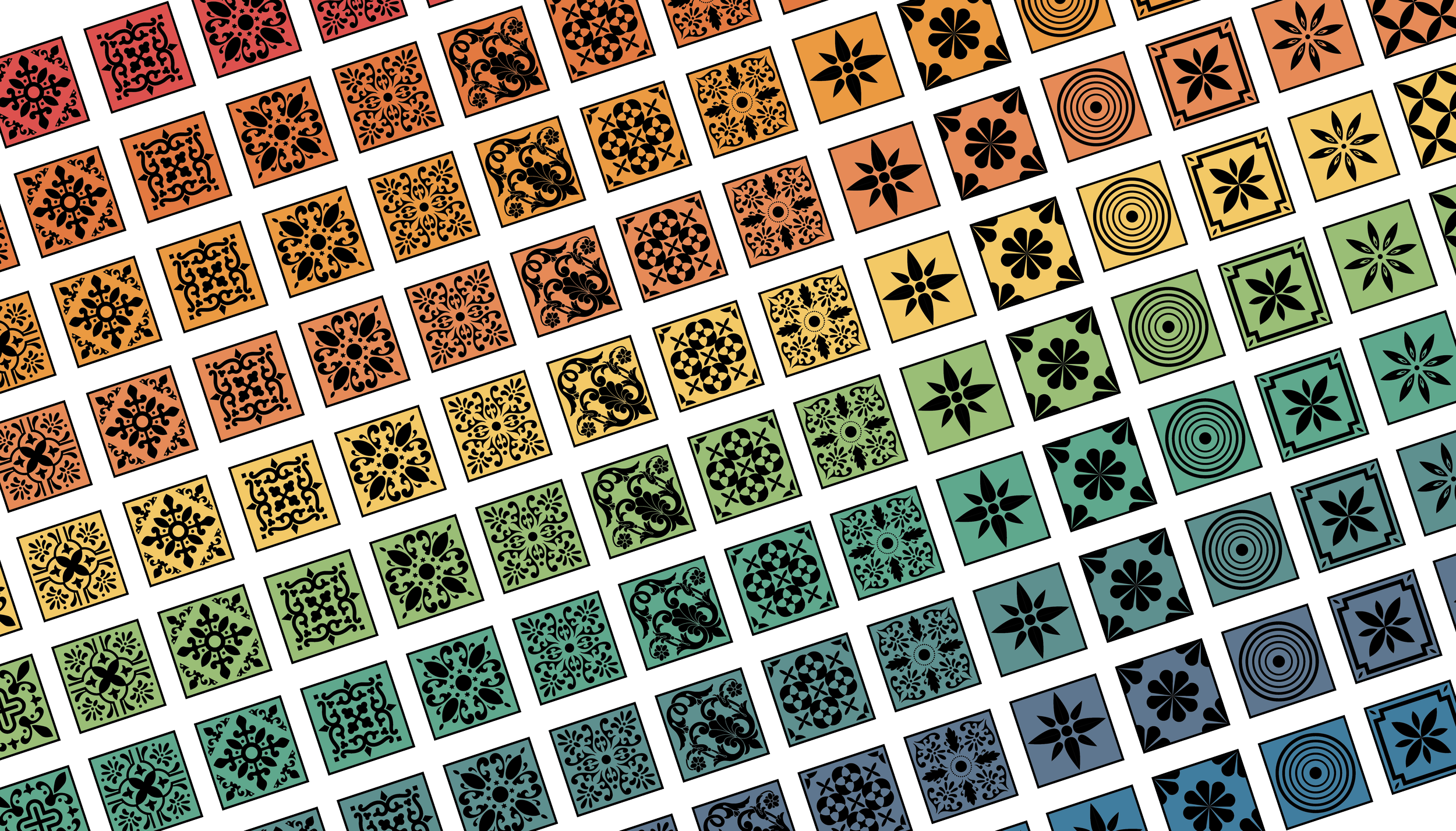
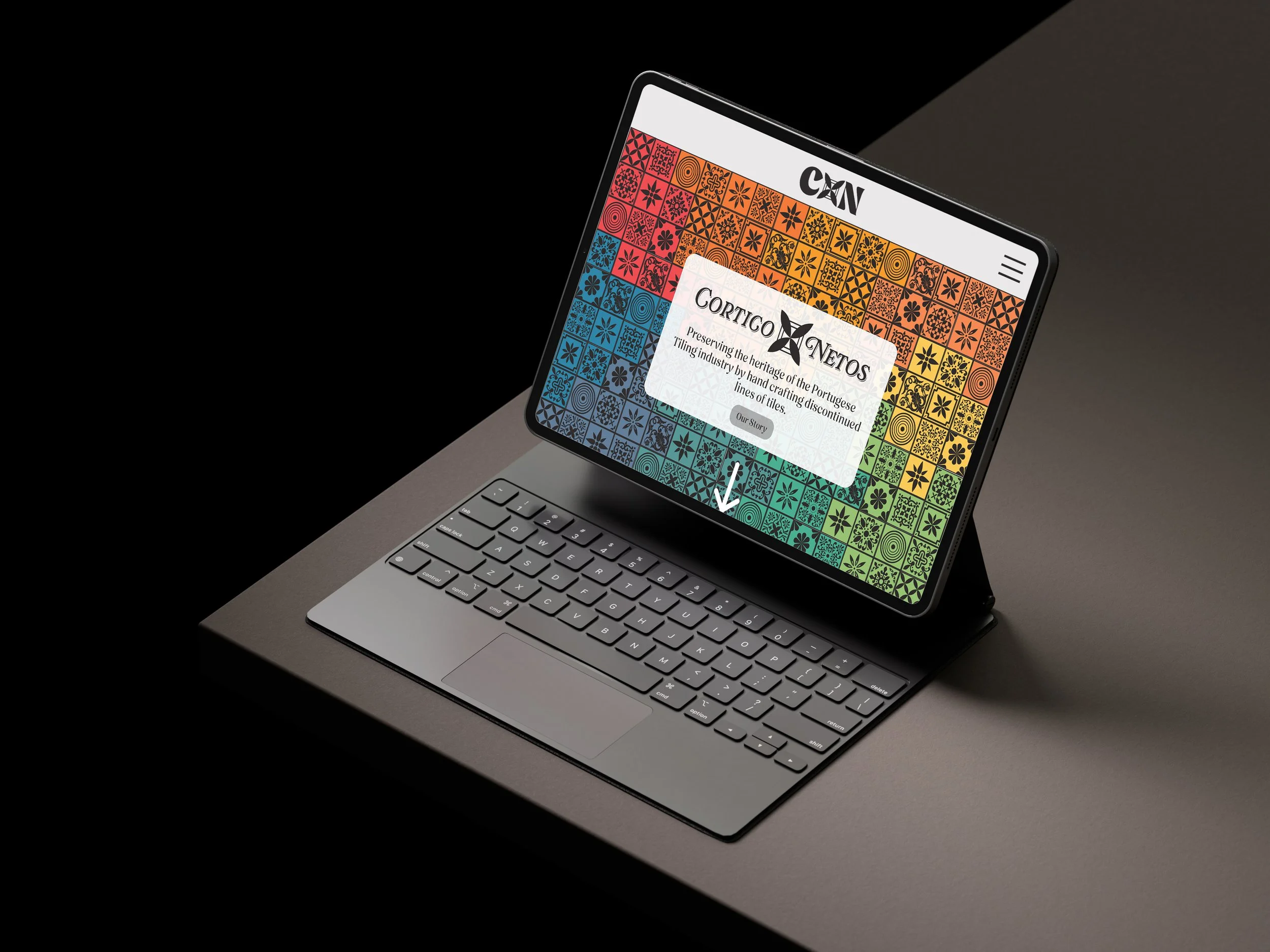
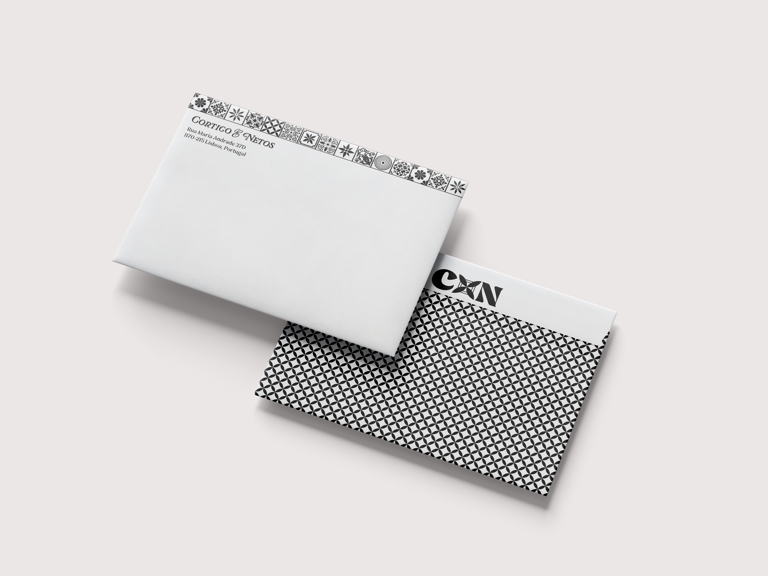
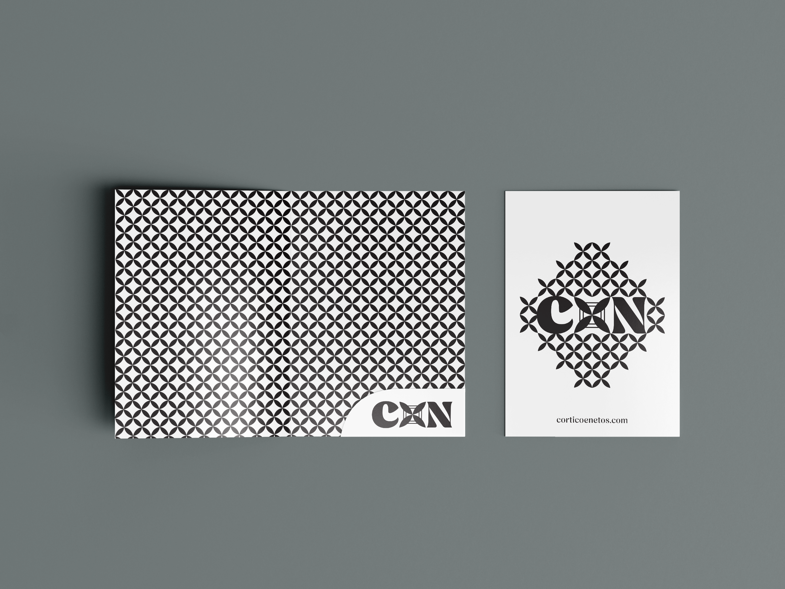
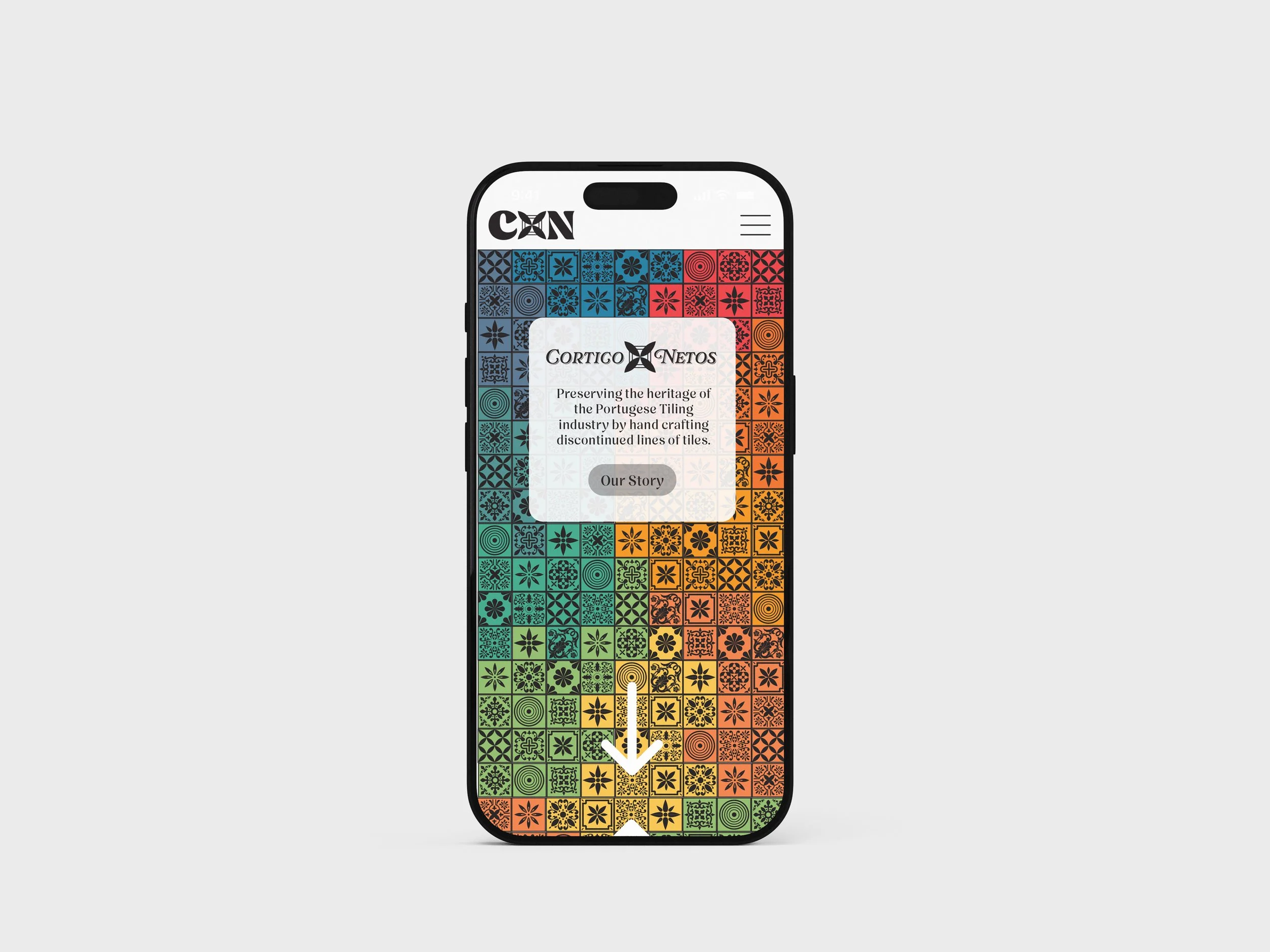
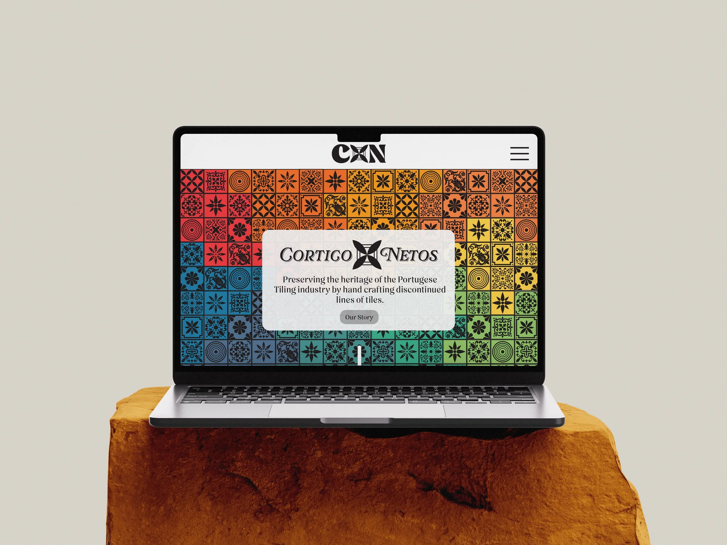
The Digital Tile Collection
The Digital Tile Collection merges vibrant colors and tile designs inspired by the existing physical tile collection at Cortico & Netos. Functioning as a brand extension, this collection brings a bold look to the brand and more clearly communicates the brand’s goals and activities. This collection was created to be applied in many ways, across digital and print media.